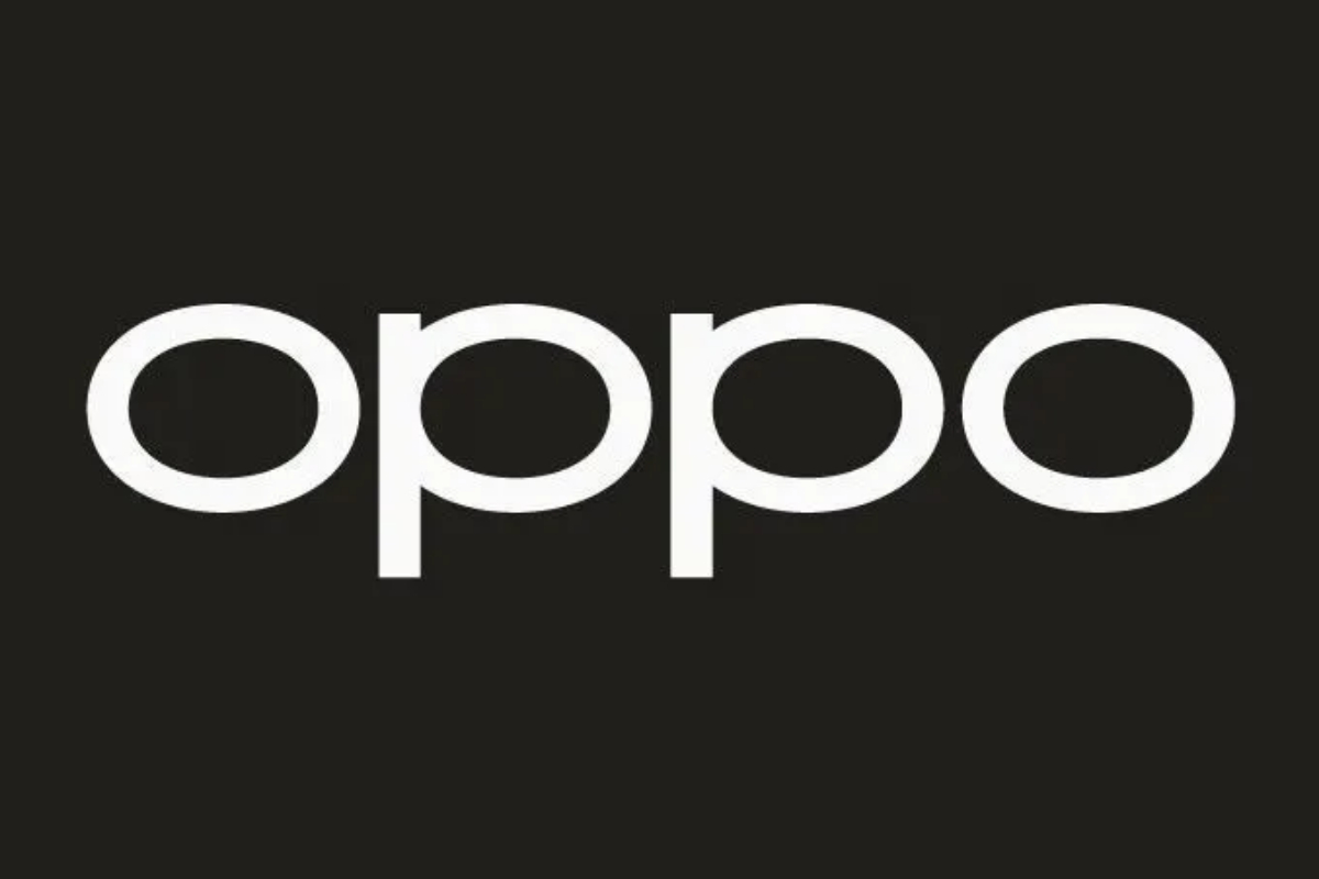
- Oppo ditches the green logo for black accents, a bold move in its visual identity.
- Chinese users spot Oppo’s logo update on Weibo profile images.
- Oppo logo shifts to monochrome, embracing minimalism.
Oppo, the renowned smartphone manufacturer, has taken a bold step by bidding farewell to its iconic green logo colour in favour of black accents.
The decision was discreetly made and later noticed by online users in China, who spotted the changes in the company’s profile images on Weibo.
Although some fans were concerned about the disappearance of the beloved green colour, Oppo assured them that green would remain an integral part of the brand.
It will be strategically incorporated into “interactive visual designs to enrich every scene where the brand meets the users”.
Looking forward, Oppo’s logo will undergo a gradual transformation to adopt a monochrome form.
[embedpost slug=”/oppo-find-n3-certified-with-100-w-charging-support/”]
This move signifies a shift towards minimalism, with the company opting for a more subtle and subdued approach to its visual identity.
As evident on their website, the once prominent green squircle has now been replaced, and the entire site has undergone a redesign.
Notably, the green logo had already been fading from Oppo’s marketing communications over time.
The brand has been embracing white letters and occasionally adapting them to different visual elements.
For instance, on the Reno10 Pro in purple, the Oppo letters are violet on the box, while on the Find X6 Pro, the logo appears in silver.
Oppo’s decision to embrace black accents and a monochrome logo marks an interesting transition for the brand’s visual identity, keeping fans intrigued and curious about the company’s future designs.


